
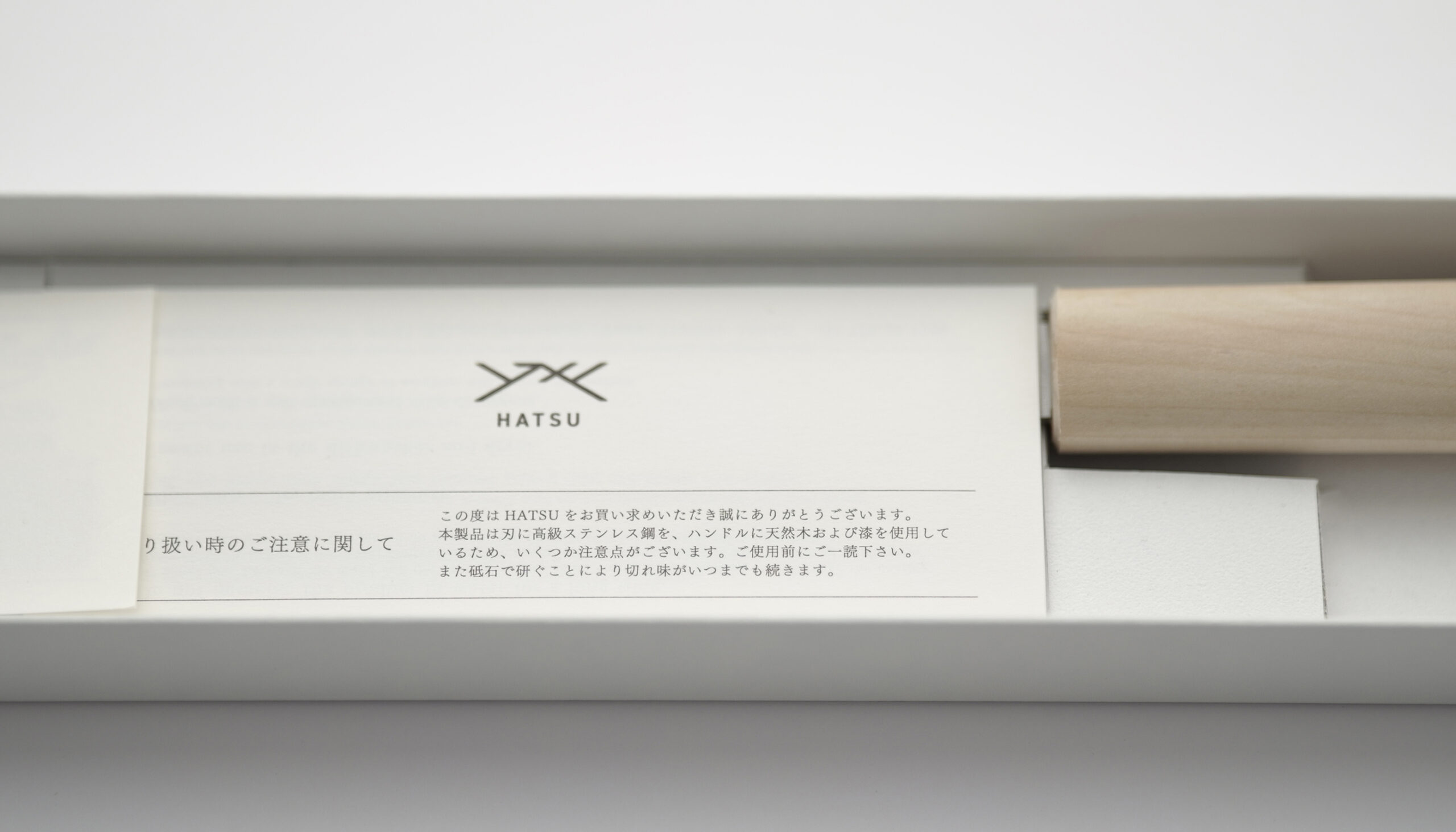
HATSU
SHARPNING FOUR / F-TRAD
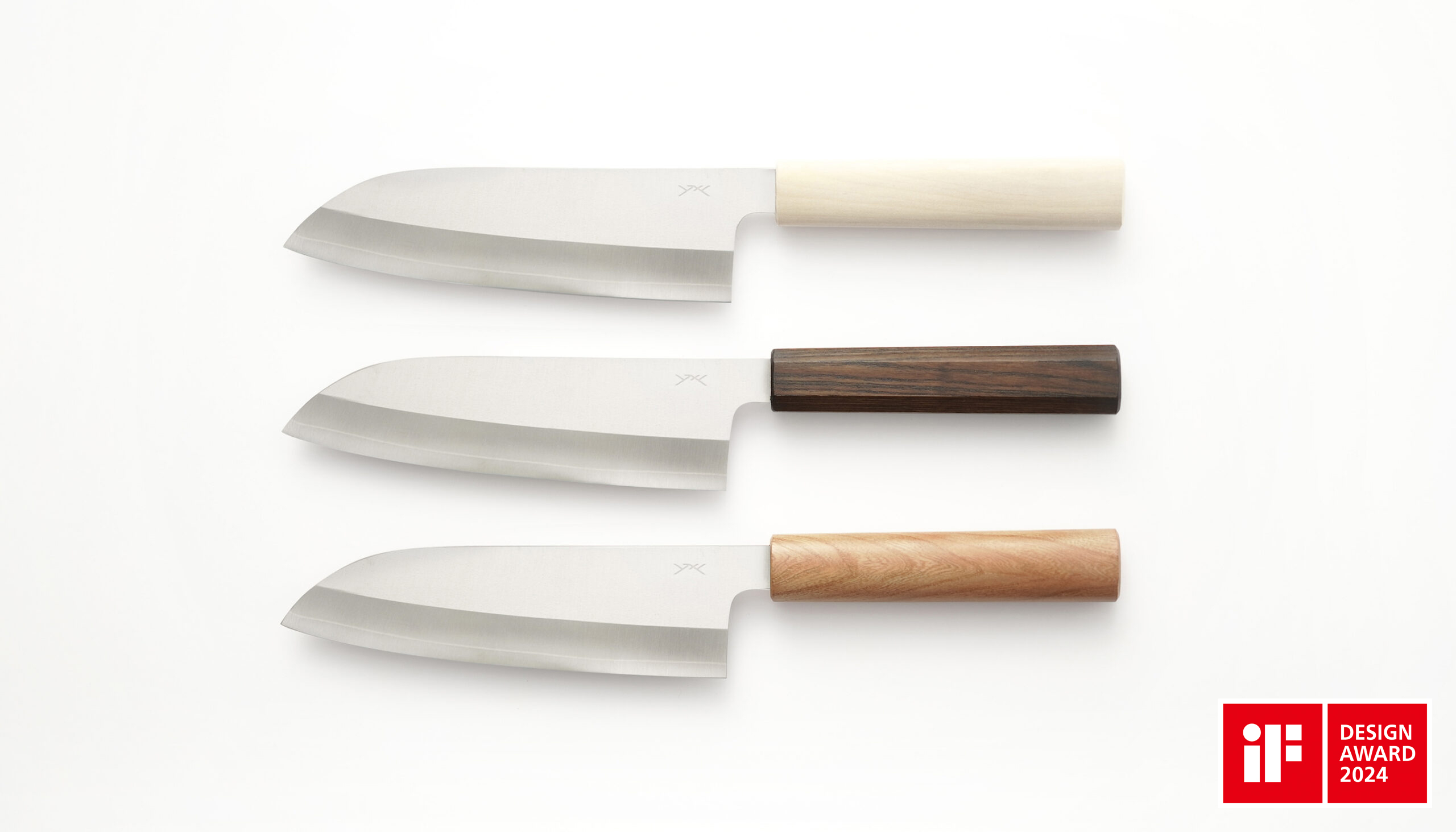
A new standard for Echizen cutlery, conceived by a traditional craftsman and a product designer.
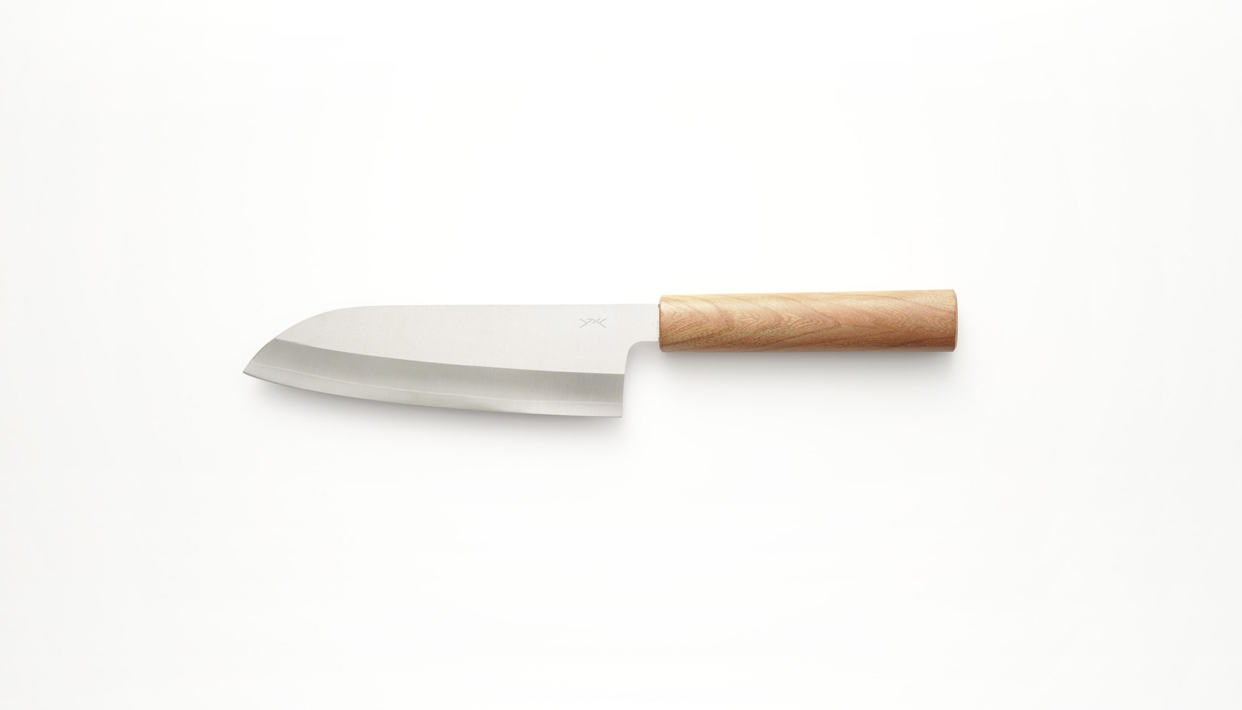
HATSU is a brand that aims to create a new standard for Echizen cutlery, one of the traditional crafts of Fukui Prefecture. We did branding works and product design for Mr. Yuji Toya, a traditional craftsman (grinder).
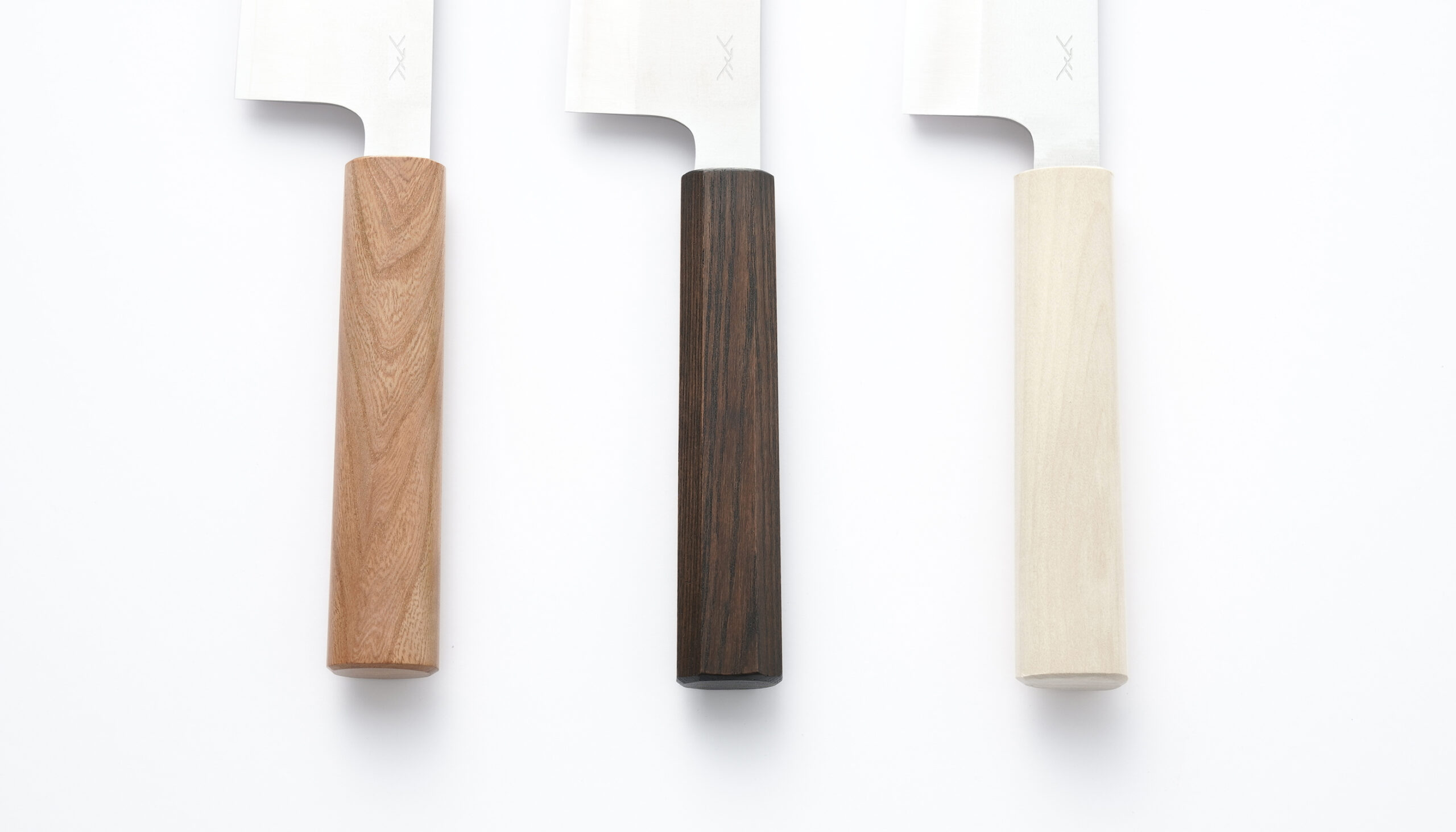
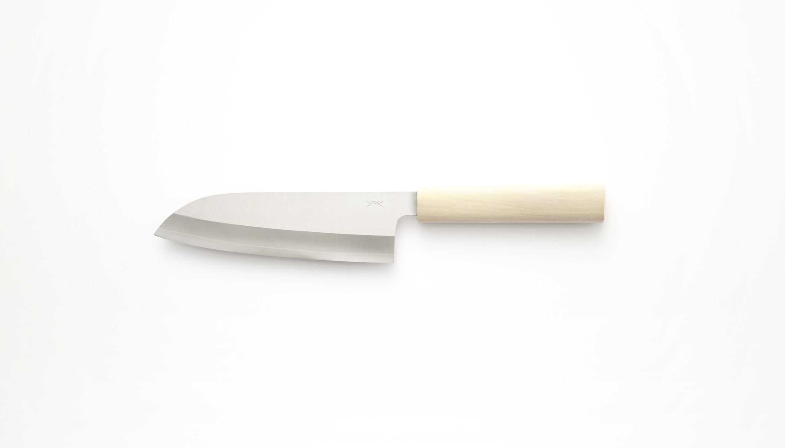
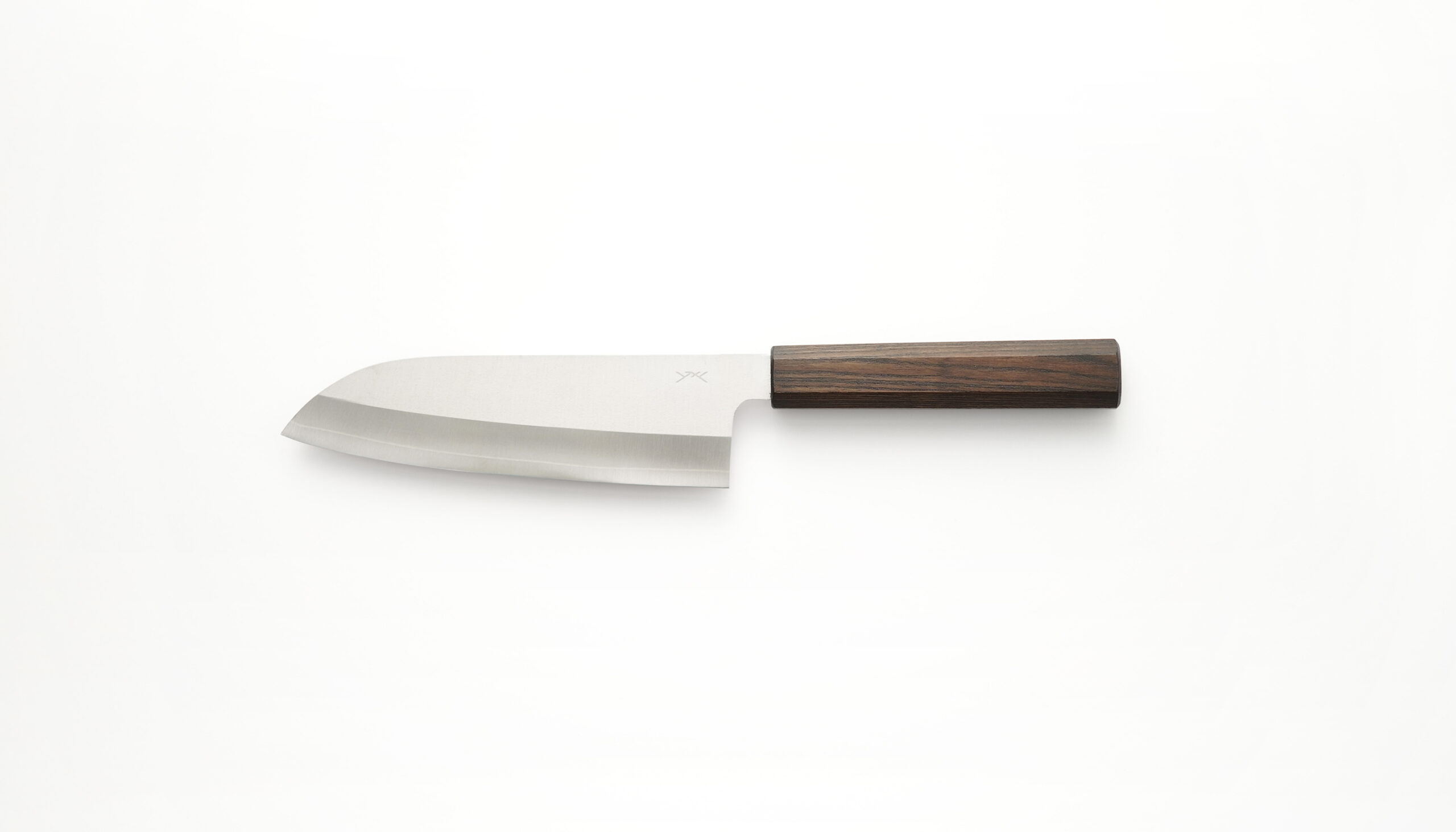
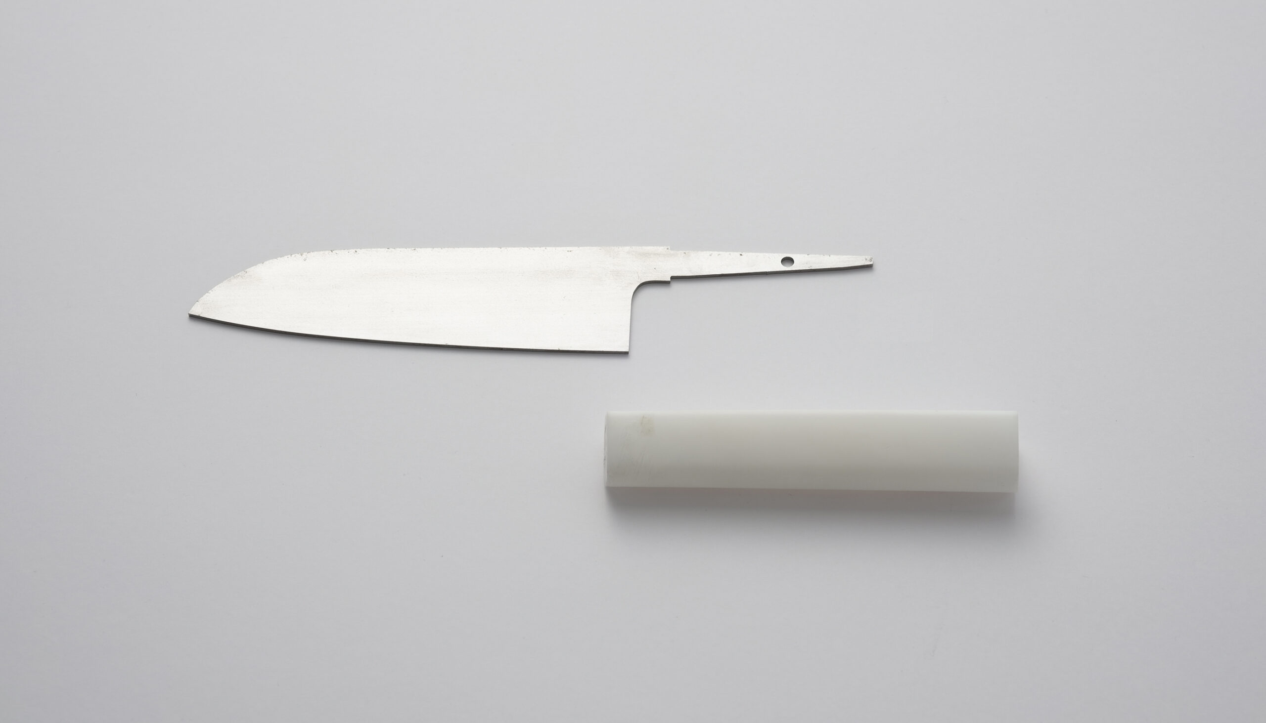
The origin of the brand name is the radical “癶”. “癶” is a hieroglyph that has evolved from “the shape of straw sandals when you prepare for a goal and put your feet together”. As much as possible, the character is used as a symbol mark, and the brand concept of being innocent, simple, and essential, is added to the traditional shape of the handle that inserts the blade, which is a circle and an octagon. We have designed a new handle with the essence of Western knives.
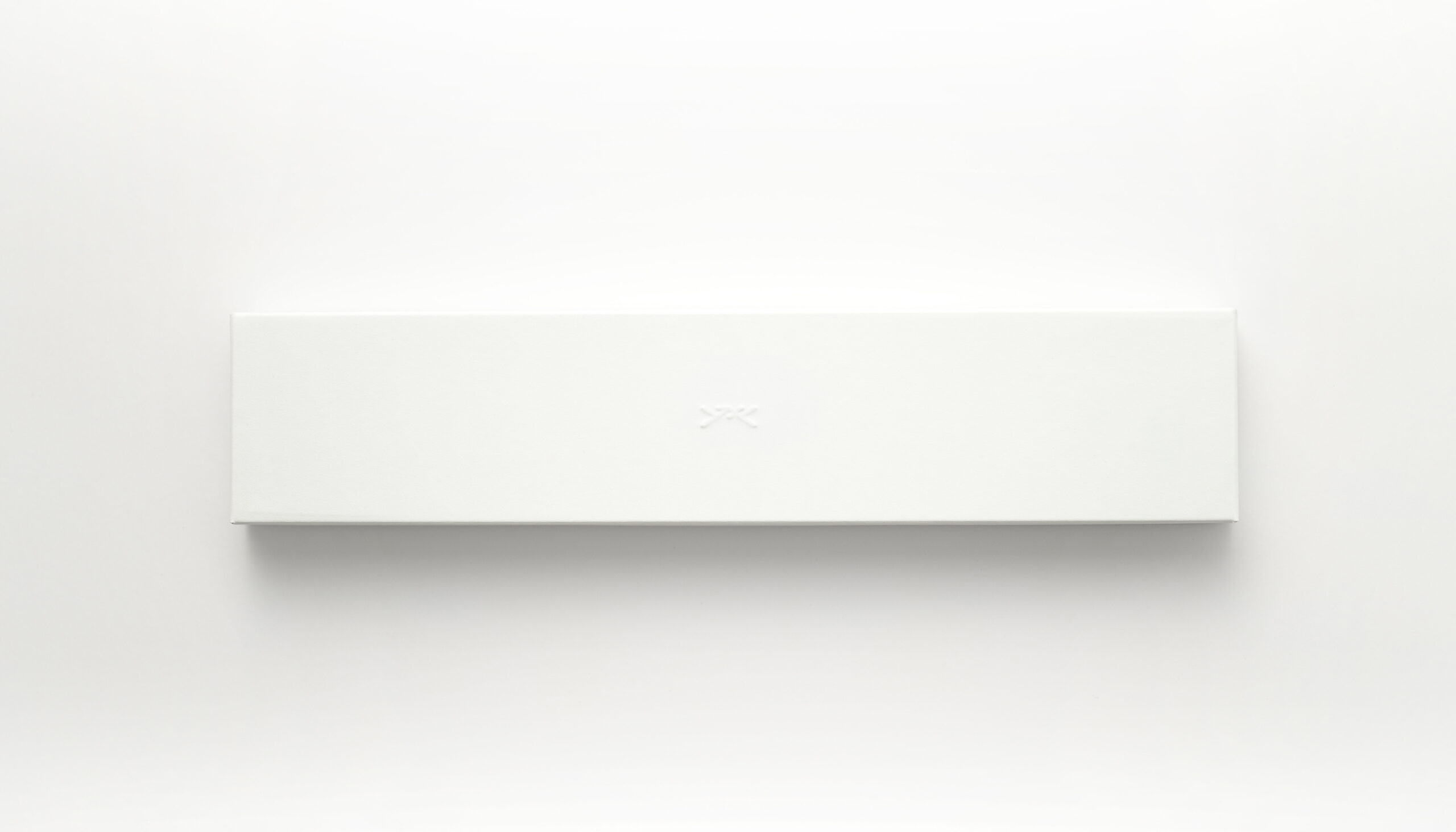
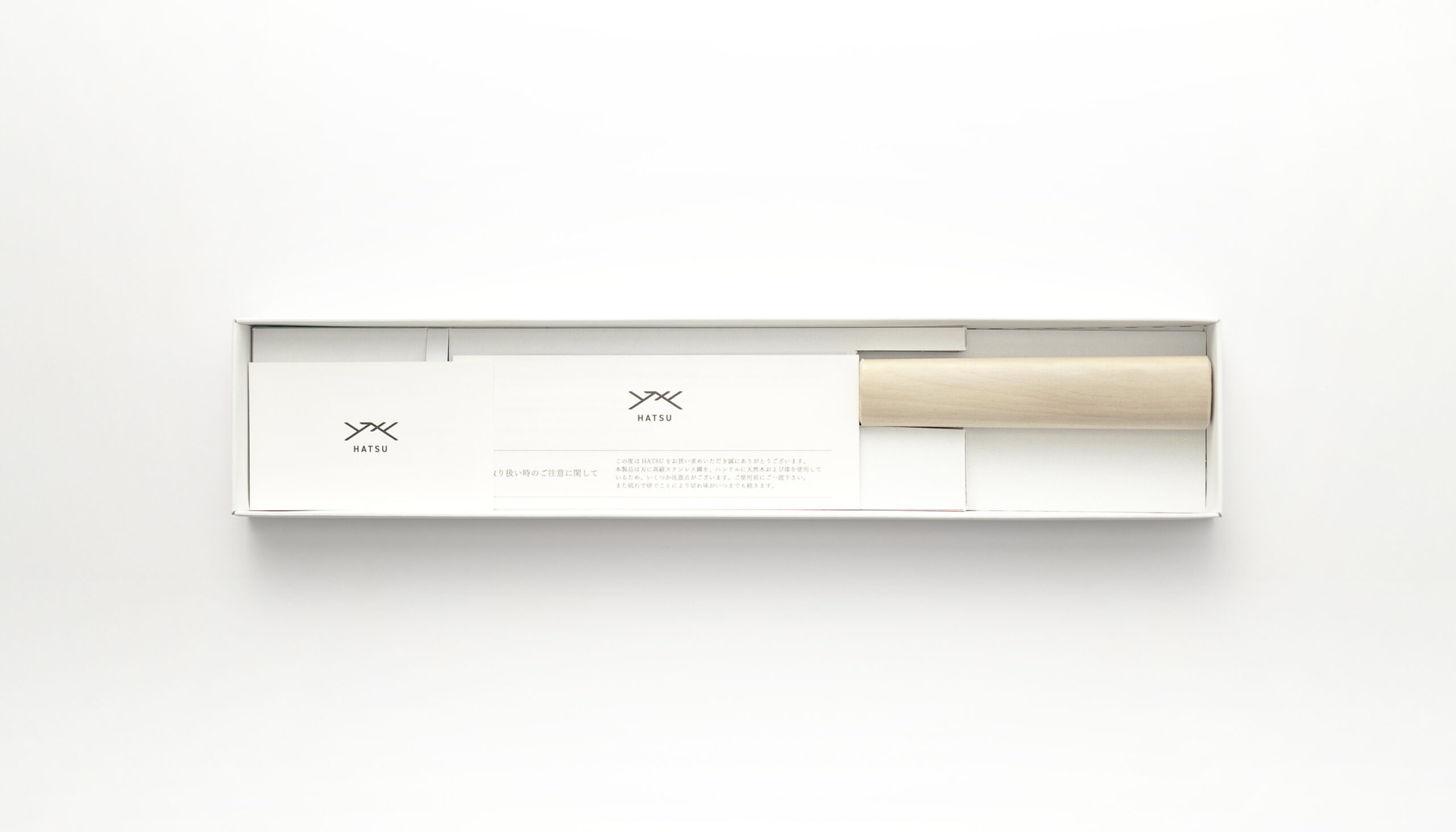
The package is a white box with no unnecessary decorations, and the brand card and instruction manual are also designed to be unified.
Art Director
KAIRI EGUCHI (KAIRI EGUCHI STUDIO Inc.)
Product Designer
KAIRI EGUCHI (KAIRI EGUCHI STUDIO Inc.)
Graphic Designer
ANZU FUJIHARA (KAIRI EGUCHI STUDIO Inc.),
ARISA SAKAI (PORTA DESIGN)
Photographer
KAIRI EGUCHI (KAIRI EGUCHI STUDIO Inc.)
Handle Manufacturing
e to e
![]()