OK-KASEI VI Project
OK-KASEI Co., Ltd.
POSITIVE BRANDING for Plastics.
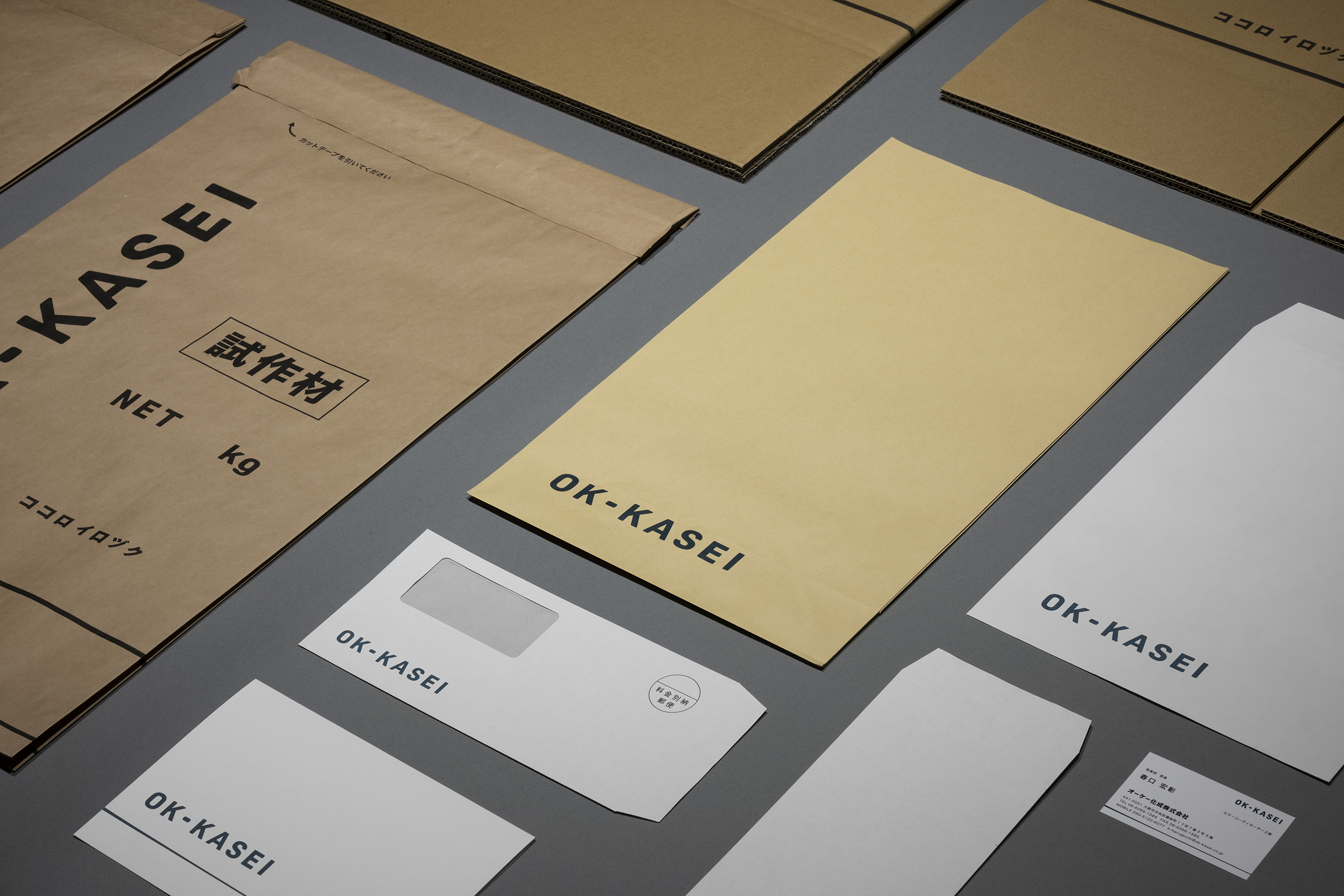
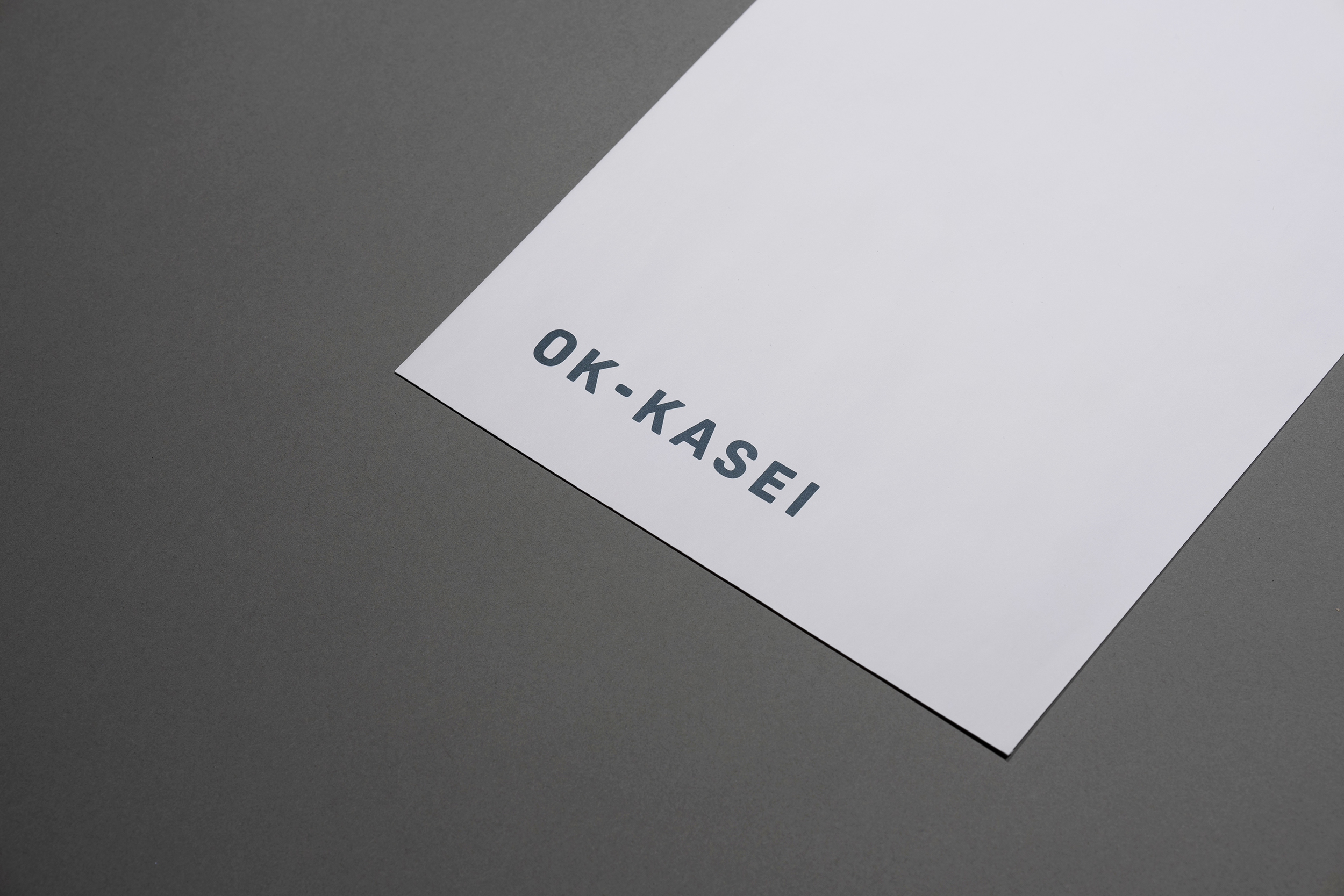
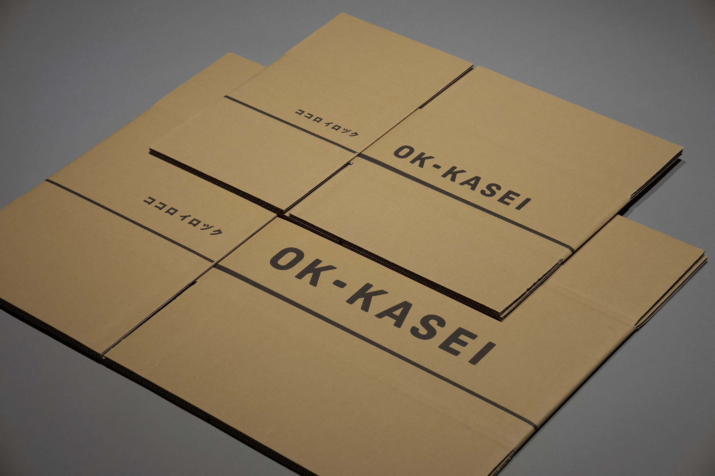
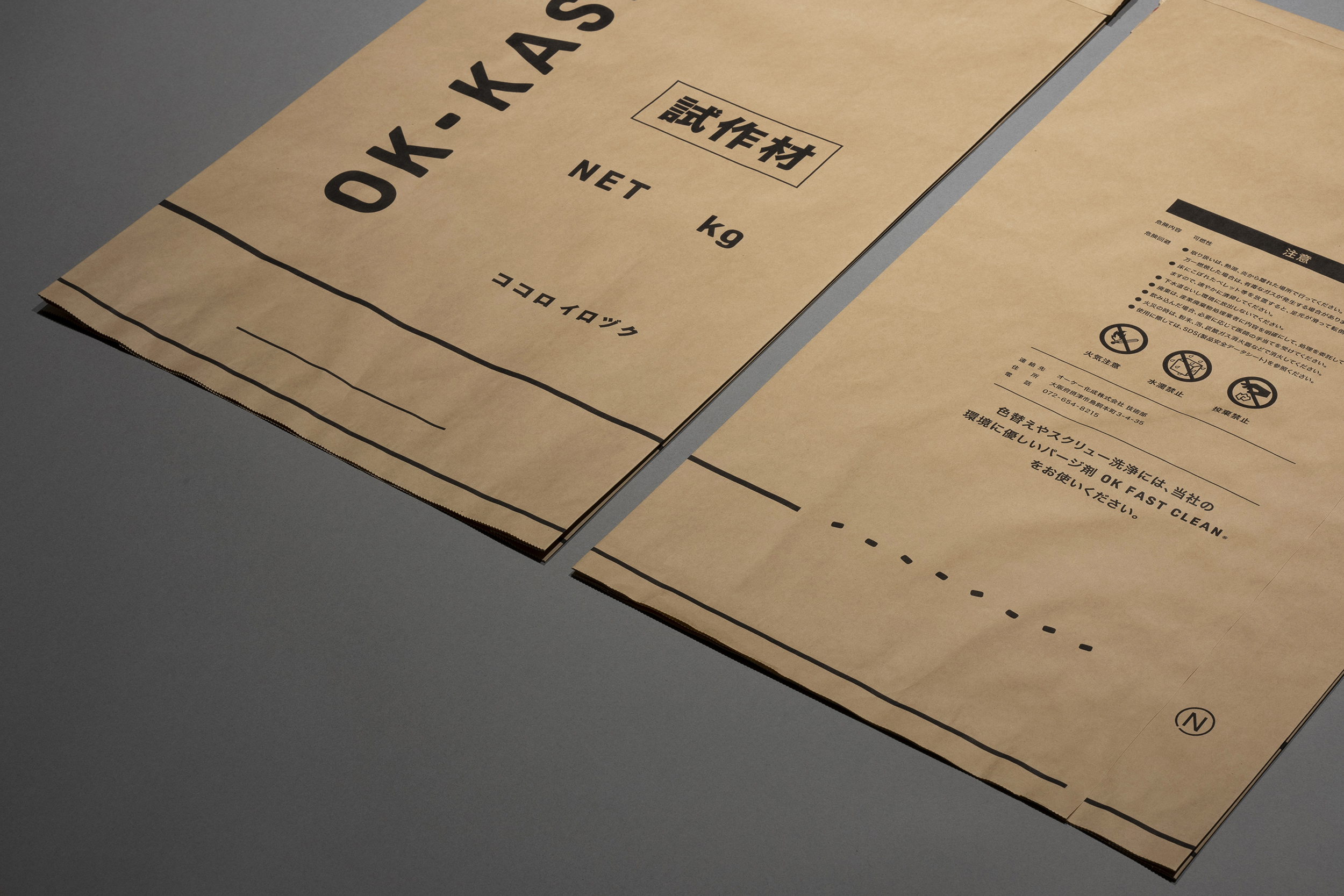
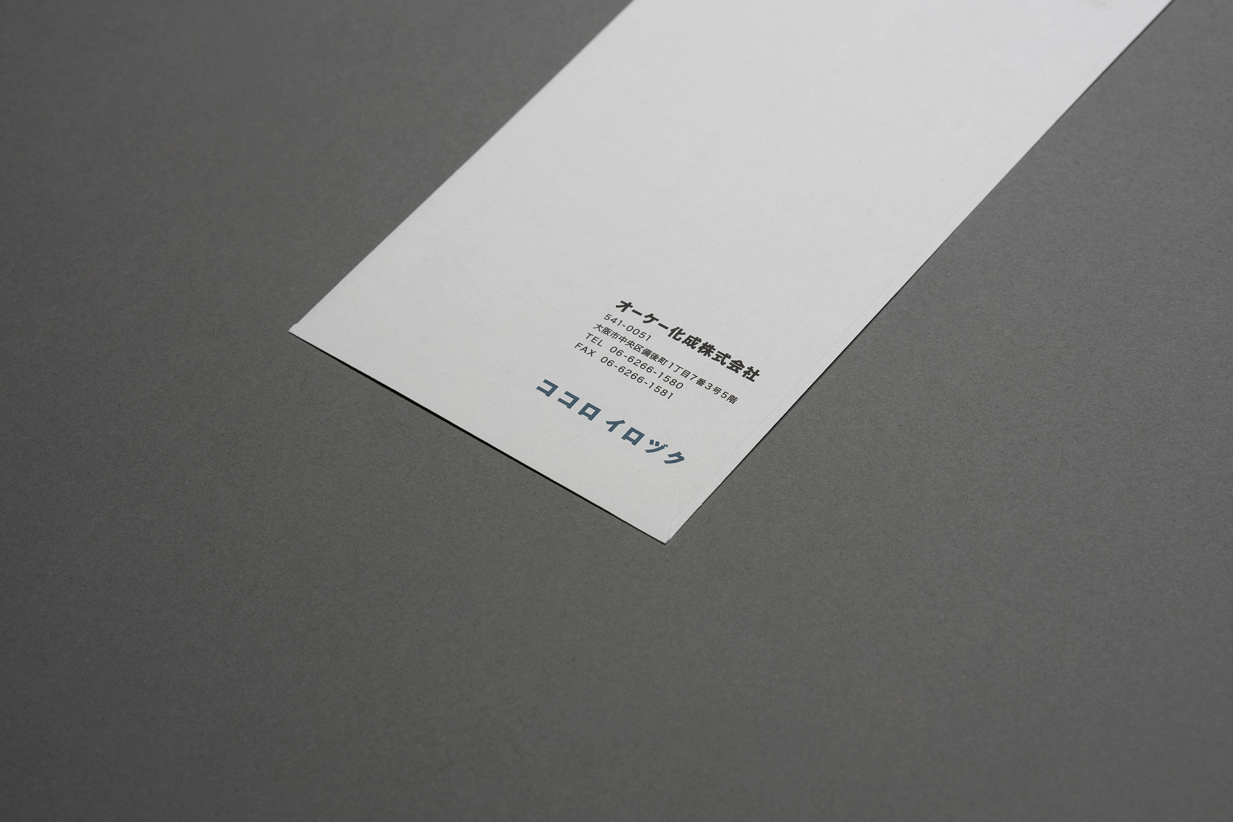
We were in charge of the VI and branding of OK Kasei Corporation, a plastic masterbatch producer, headquartered in Osaka Prefecture, Japan. In order to weave an identity that springs from within the company, we took the time to interview dozens of people about what direction they wanted the company to take in the future, including managers and front-line employees. We analyzed what we found and used it as the basis for creative work, starting with a renewal of the logotype, which had not been redesigned in several decades, and then provided total direction and design developed the symbol mark, corporate color, tagline, business cards, envelopes, cardboard, product bags, website, photography for Instagram, building signage, and factory signage, etc. The value that OK-Kasei Corporation provides to its clients is not simply in the provision of materials but in the enhancement of the feelings of the designers to whom they provide the materials and also in coloring the minds of the end users. Our tagline is "kokoroirozuku," (“coloring the mind”) with the intention of shifting the current negative perception of the value of plastics to a positive one through the accumulation of these efforts. In terms of design, the hyphen in the OK-KASEI corporate logo is a symbol mark called "Swelled Hyphen," which is a pellet that makes one's heart swell. For the corporate color, we defined color with a high degree of difficulty in color mixing to highlight the advanced color mixing technology that OK Kasei is proud of. We named it "Shinpeki" as the color of the deep sea with high creativity. Regarding the design of communication tools, if you look closely at the single line drawn uniformly on business cards and cardboard, the beginning is slightly thickened. This is not a simple line design, but an iconic representation of the Masterbadge production process. On the back of the actual pellets and bags of product that contain the Master badge, we designed the way it is cut and turned into pellets. With such a playful spirit, we think that the package is designed to give people a sense of the inherent uniqueness within OK Kasei's solemnity.
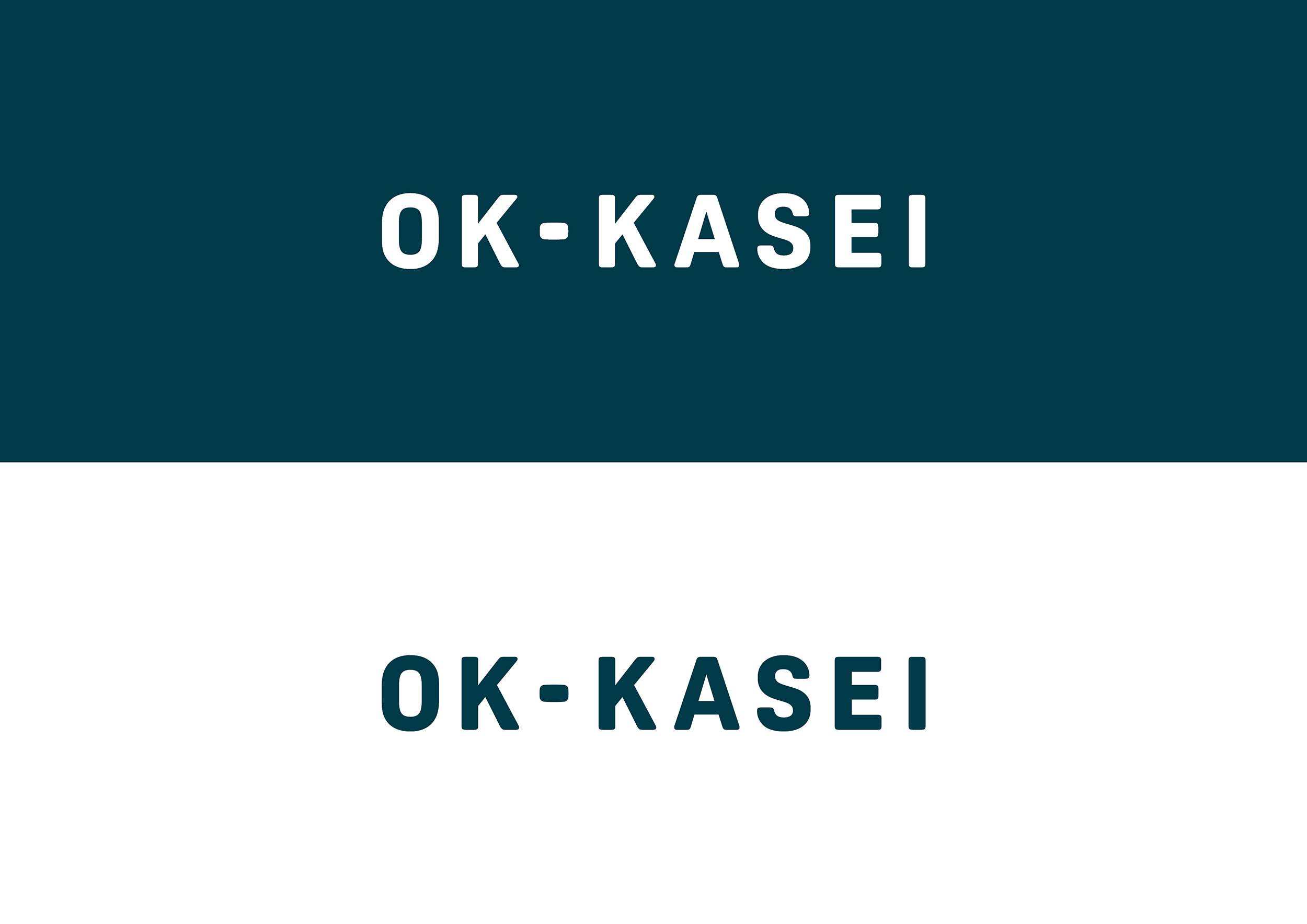

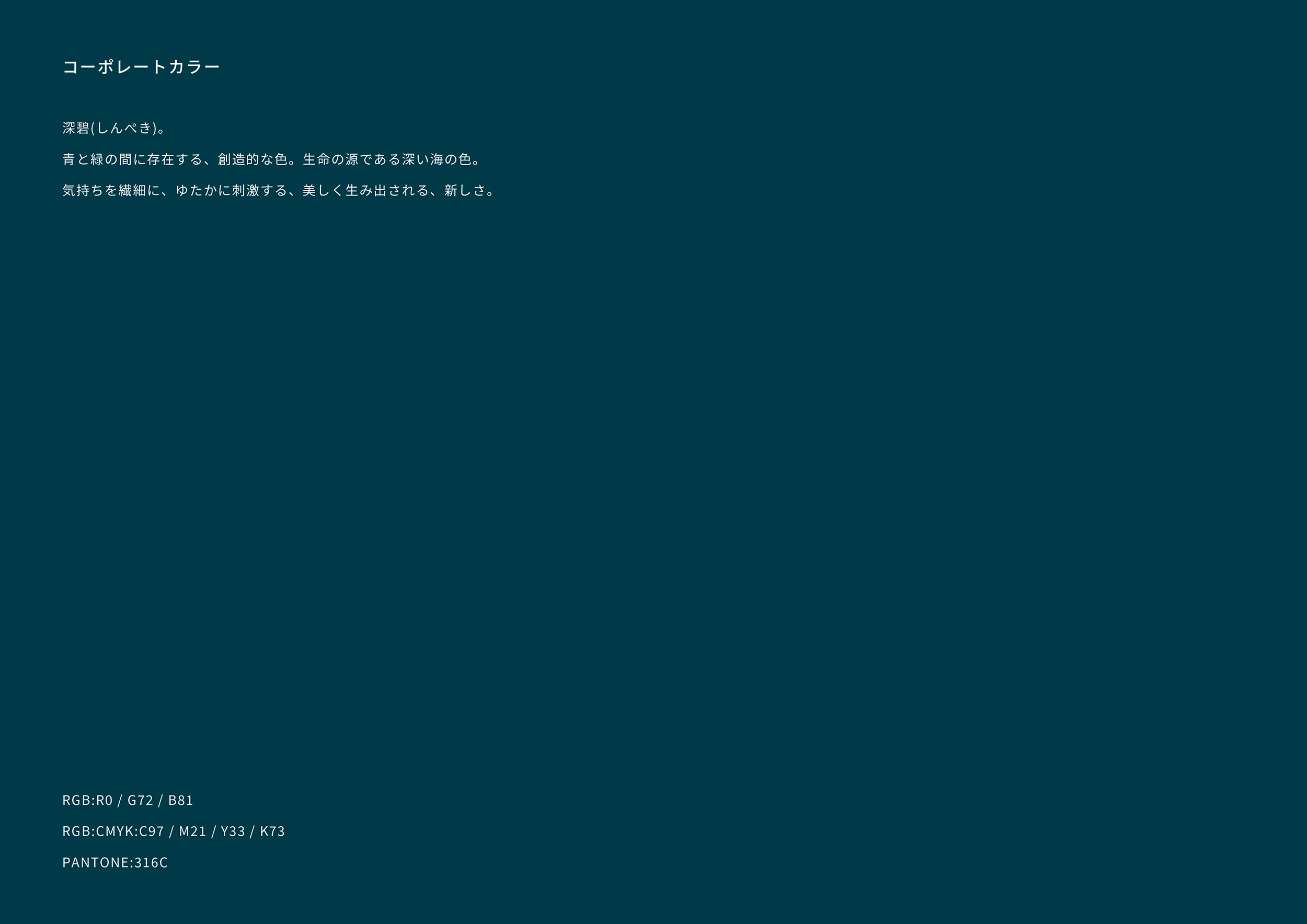
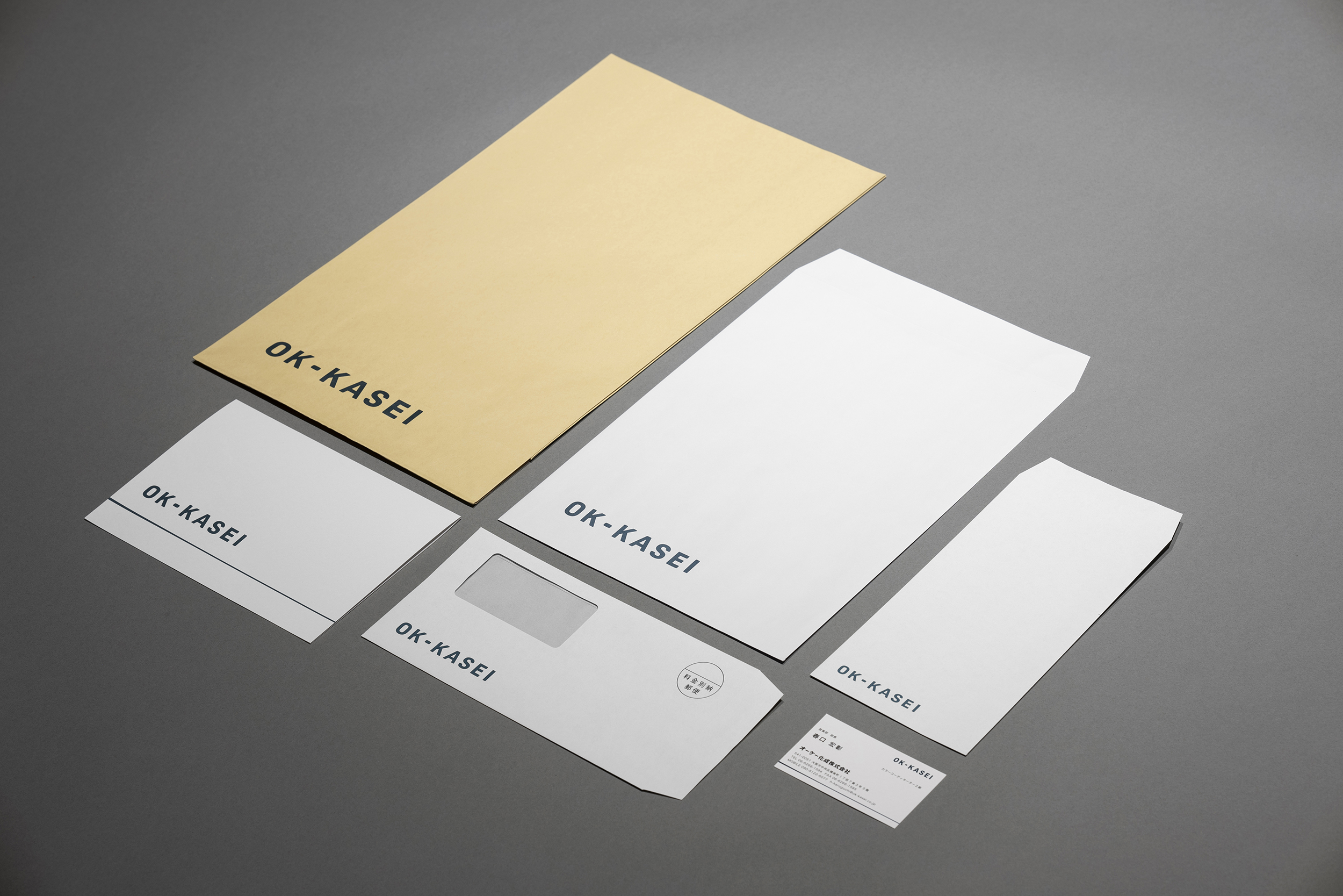
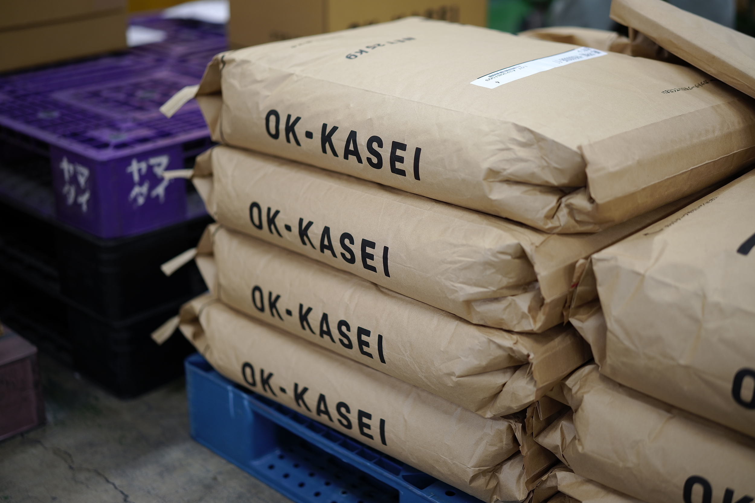
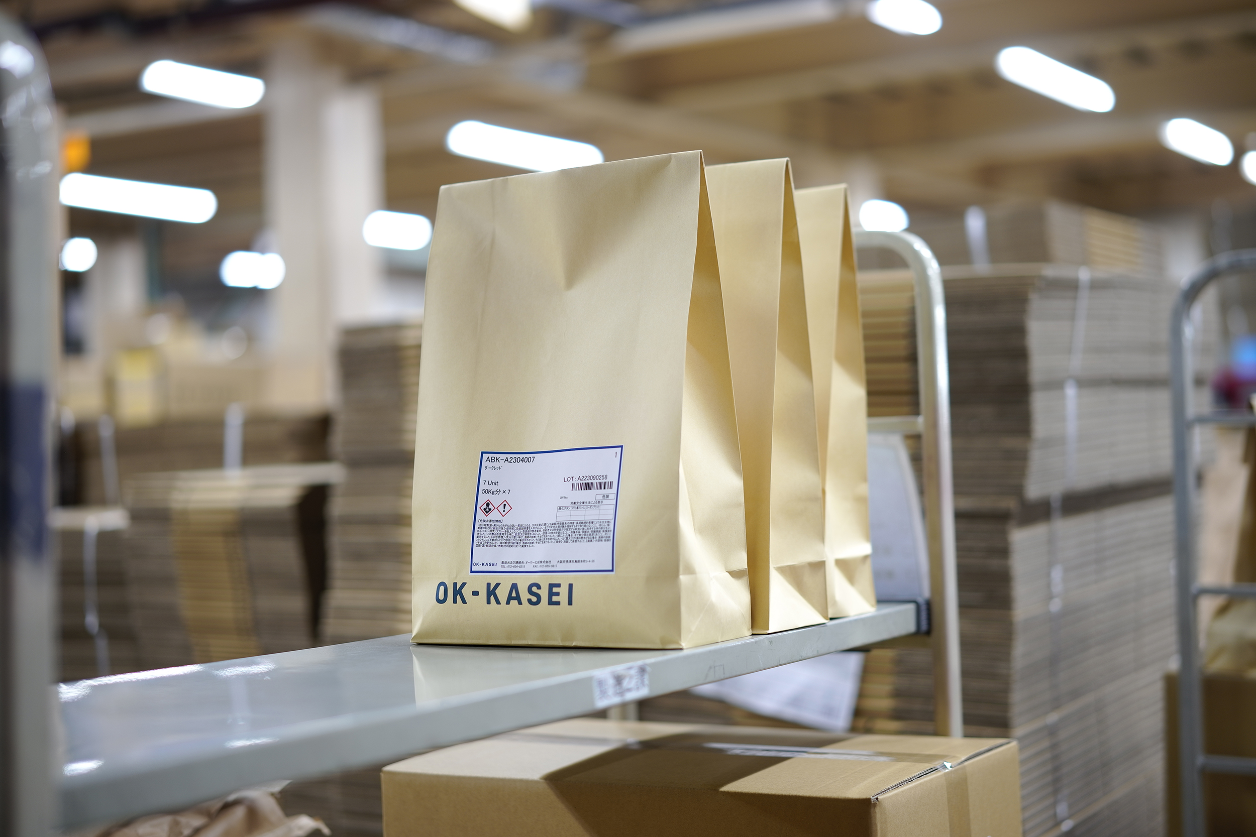
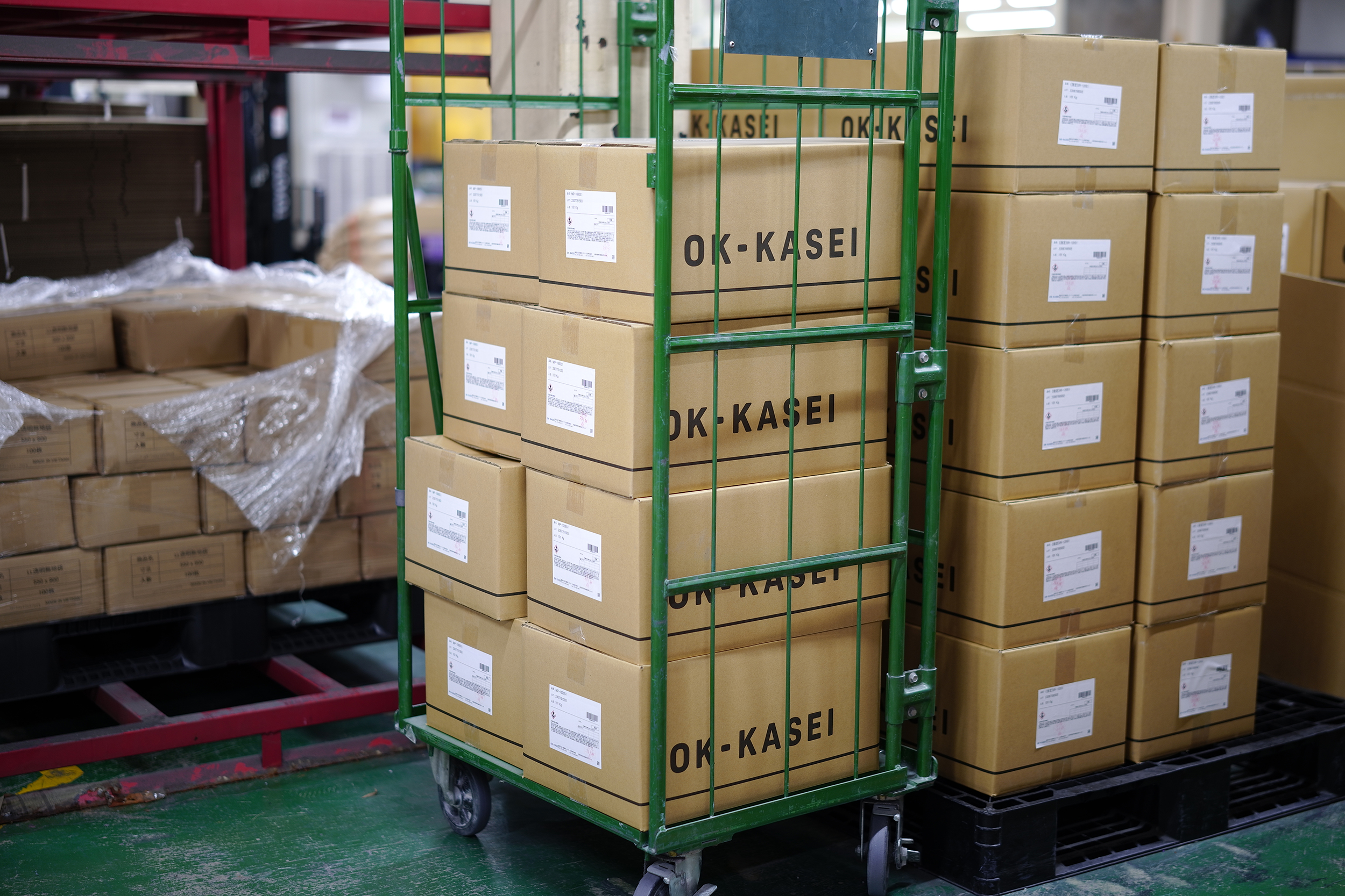

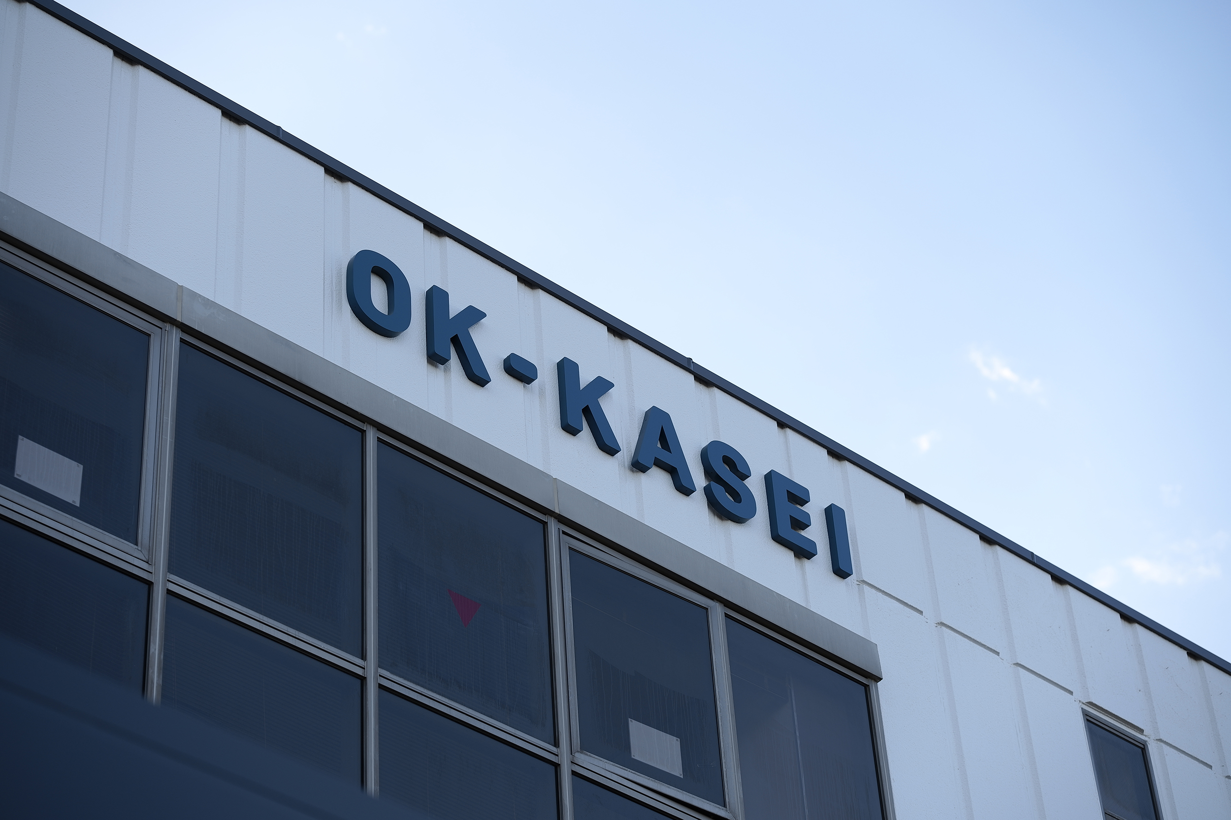

We were in charge of the VI and branding of OK Kasei Corporation, a plastic masterbatch producer, headquartered in Osaka Prefecture, Japan. In order to weave an identity that springs from within the company, we took the time to interview dozens of people about what direction they wanted the company to take in the future, including managers and front-line employees. We analyzed what we found and used it as the basis for creative work, starting with a renewal of the logotype, which had not been redesigned in several decades, and then provided total direction and design developed the symbol mark, corporate color, tagline, business cards, envelopes, cardboard, product bags, website, photography for Instagram, building signage, and factory signage, etc. The value that OK-Kasei Corporation provides to its clients is not simply in the provision of materials but in the enhancement of the feelings of the designers to whom they provide the materials and also in coloring the minds of the end users. Our tagline is "kokoroirozuku," (“coloring the mind”) with the intention of shifting the current negative perception of the value of plastics to a positive one through the accumulation of these efforts. In terms of design, the hyphen in the OK-KASEI corporate logo is a symbol mark called "Swelled Hyphen," which is a pellet that makes one's heart swell. For the corporate color, we defined color with a high degree of difficulty in color mixing to highlight the advanced color mixing technology that OK Kasei is proud of. We named it "Shinpeki" as the color of the deep sea with high creativity. Regarding the design of communication tools, if you look closely at the single line drawn uniformly on business cards and cardboard, the beginning is slightly thickened. This is not a simple line design, but an iconic representation of the Masterbadge production process. On the back of the actual pellets and bags of product that contain the Master badge, we designed the way it is cut and turned into pellets. With such a playful spirit, we think that the package is designed to give people a sense of the inherent uniqueness within OK Kasei's solemnity.
![]()
