SK-SATO VI Project
Sato Keiryoki Mfg. Co., Ltd.


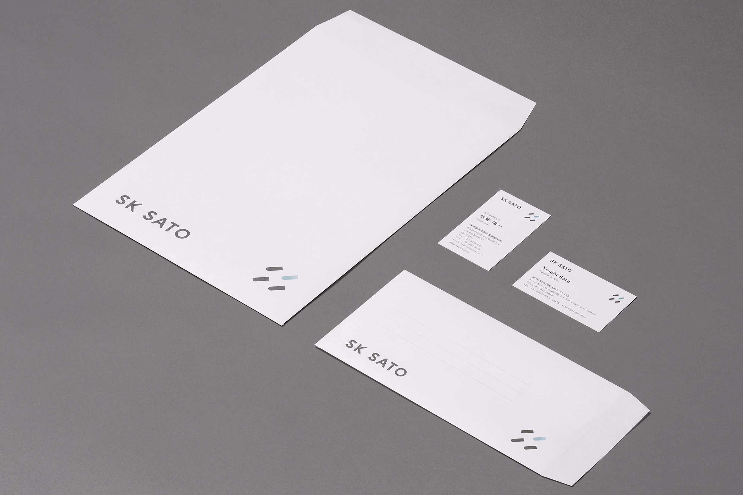
We were in charge of the visual indentity and rebranding of Sato Measuring Instrument Manufacturing Co.
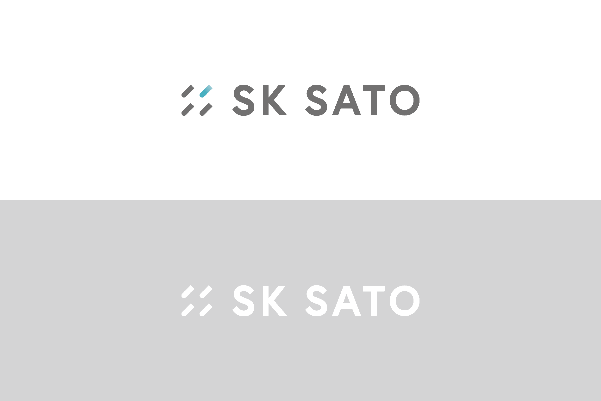
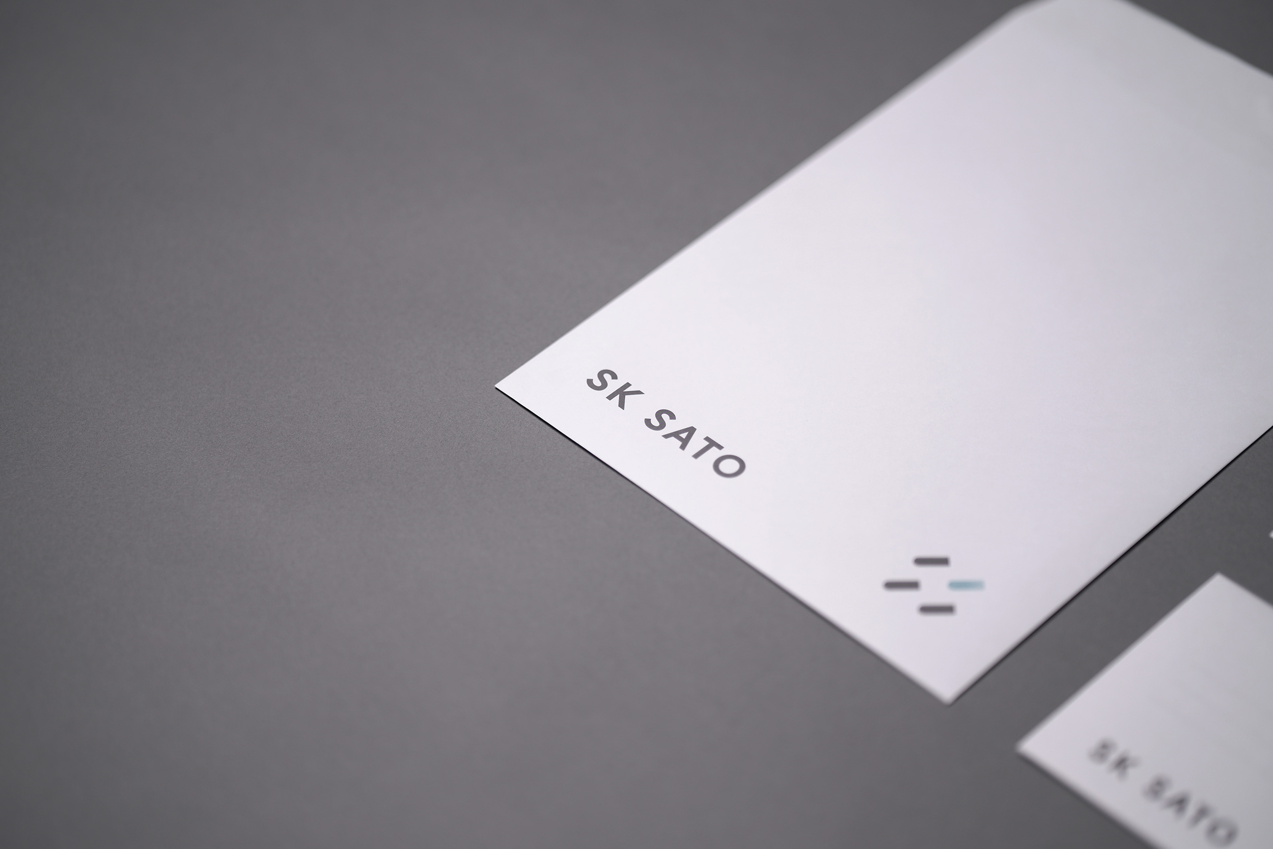
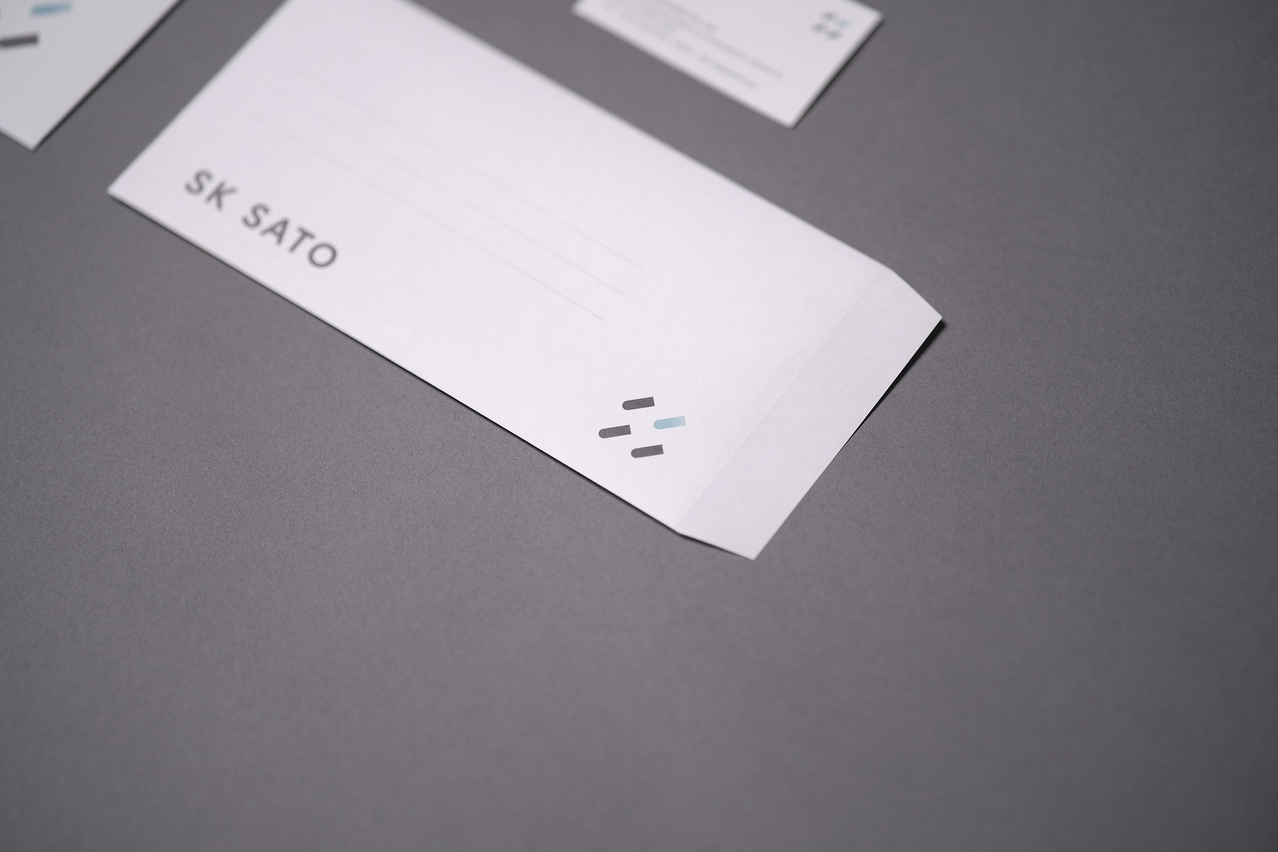
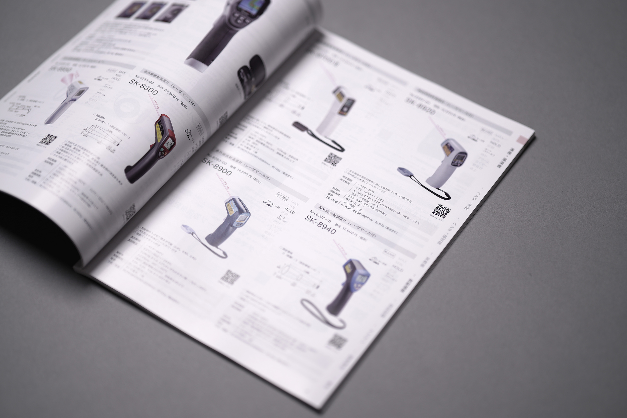
The company has a long history as a pioneer in measuring instruments. In order to renew its brand and move forward as a company, we conducted interviews with key persons to elicit the company’s latent passion and identity. We then analyzed, verbalized, and organized what we found in these interviews, and using them as the basis for creative work. We provided total direction and design for the company’s logo, which had not been redesigned in several decades, as well as its symbol mark, corporate colors, tagline, business cards, envelopes, packaging, signage, and general catalogs.
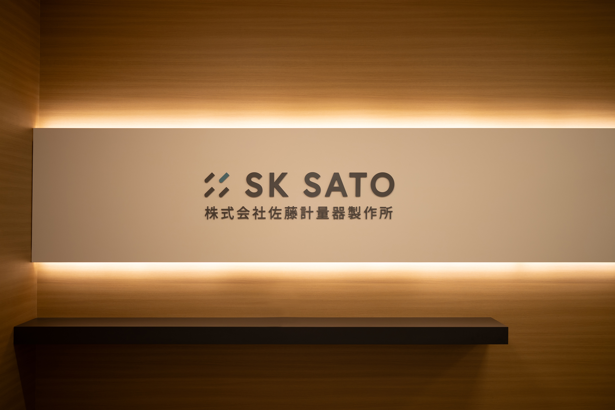
The tagline [WATCHING THE UNKNOWNS] is a phrase that expresses the company’s overall stance, based on the philosophy of continuing to measure the unknown. The symbol mark was designed with a motif of a thermometer, the starting point of the company, with a blank space that could be expanded into a pattern. The corporate color is a refreshing blue-green color called “Frontier Blue. This color was designed as a sophisticated yet fresh color for the concept of taking on challenges in new areas while being a color of integrity. It is used in all communication tools.
Art Director
KAIRI EGUCHI (KAIRI EGUCHI STUDIO Inc.)
Graphic Designer
ANZU FUJIHARA (KAIRI EGUCHI STUDIO Inc.)
Photographer
KAIRI EGUCHI、ANZU FUJIHARA
(KAIRI EGUCHI STUDIO Inc.)
![]()
